XPS Mortality Tracker


The XPS Mortality Tracker helps employers and pension scheme trustees understand trends in life expectancies, which is vital to help inform decision-making.
The interactive graphs below allow you to understand how mortality rates have developed in recent years, make historical comparisons and compare how mortality rates have developed for various groups such as by age band and sex.

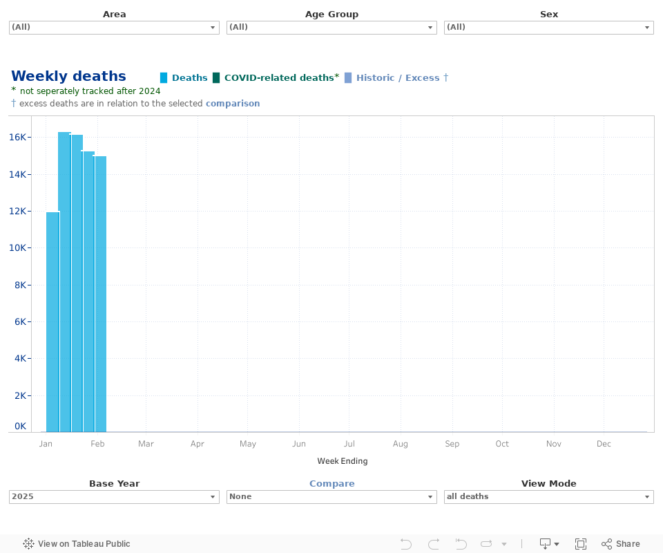
XPS Weekly Mortality Tracker
The graph below shows the number of deaths in each week for England, Wales and Scotland and allows you to create your own chart by sex, age group and area. Each selection can be compared to historical data such as the number of deaths in that week in 2023 or or the five-year average to 2019 (i.e. the 5-years prior to the COVID-19 pandemic). Data on COVID-19 and non-COVID-19 related deaths can also be found in data for the years 2020-2023. Hovering over a point on a bar or line will provide the figure for that particular group.
XPS Cumulative Mortality Tracker
The graph below shows the total number of deaths in your chosen year up to the end of each week for England, Wales and Scotland and allows you to create your own chart by sex, age group and area. Each selection can be compared to historical data such as the total number of deaths up to the end of each week in 2023 or the five-year average to 2019 (i.e. the 5-years prior to the COVID-19 pandemic). Data on COVID-19 and non-COVID-19 related deaths can also be found in data for the years 2020-2023. Hovering over a point on a bar or line will provide the figure for that particular group.
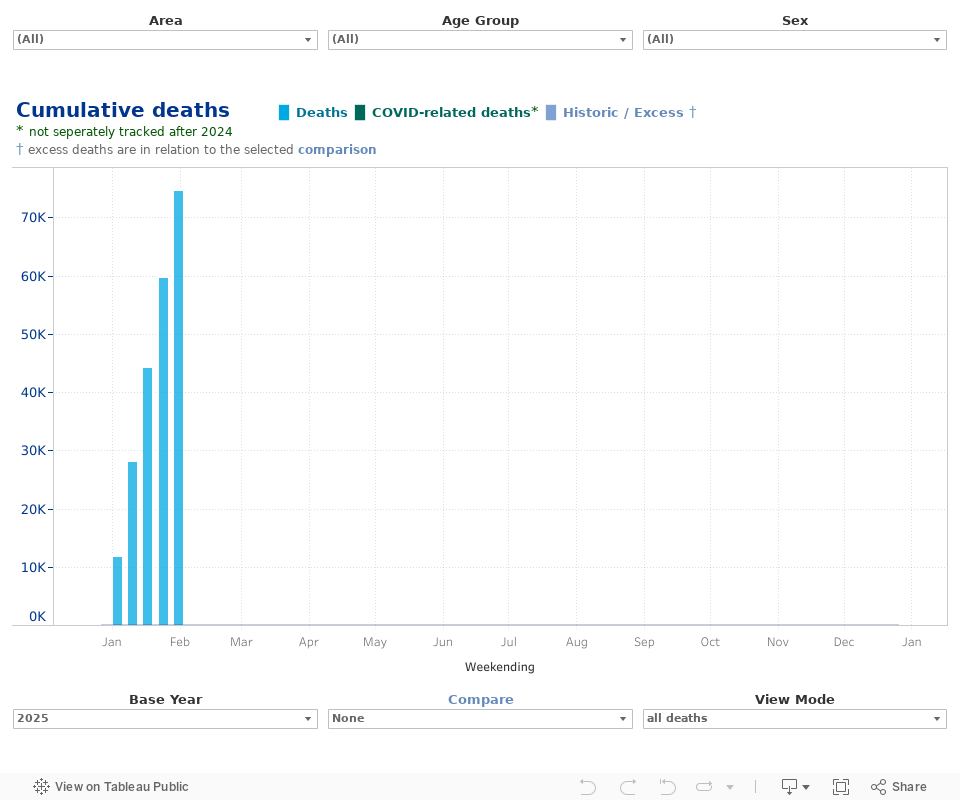
Source: XPS Group. The data in the charts above incorporate data from the Office for National Statistics, and National Records of Scotland.
- The charts above should not be relied upon for detailed advice or taken as an authoritative statement of the law.
- Register for events
- Join our mailing list
Register for events
We enjoy hosting a wide range of events for pension scheme trustees, corporate sponsors, independent trustees, and pensions professionals.
Join our mailing list
Keep up to date with our latest news and views including pension briefings, XPS insights, reports and event invitations.